Theming
Colors
Set a panel's colors with Tailwind's palettes or a hex value, and text stays readable whatever you choose.
use Xelqun\Panels\Support\Colors\Color;

$panel->colors([
    'primary' => Color::Amber,
    'danger' => Color::Rose,
    'gray' => Color::Slate,
]);
Color holds Tailwind's 26 palettes. Any color you leave out keeps its default: danger Red, gray Zinc, info Blue, success Green, warning Amber, and a blue primary.
Text stays readable whatever you choose. A button keeps white text, and its fill deepens just enough for white to clear WCAG AA's 4.5:1. Yellow, Amber and Lime go bright instead, with dark text in their own hue. A hex value gets the same treatment.
Letting people choose
Pass a closure, which runs on every request.
$panel->colors(fn (): array => ['primary' => Color::fromName(auth()->user()?->theme) ?? Color::Blue]);
Color::options() gives a Select its choices. Anything that isn't a color is refused, because these end up in a style attribute.

Tokens
Everything else is a --xq-* token, set under :root[data-xq-panel].
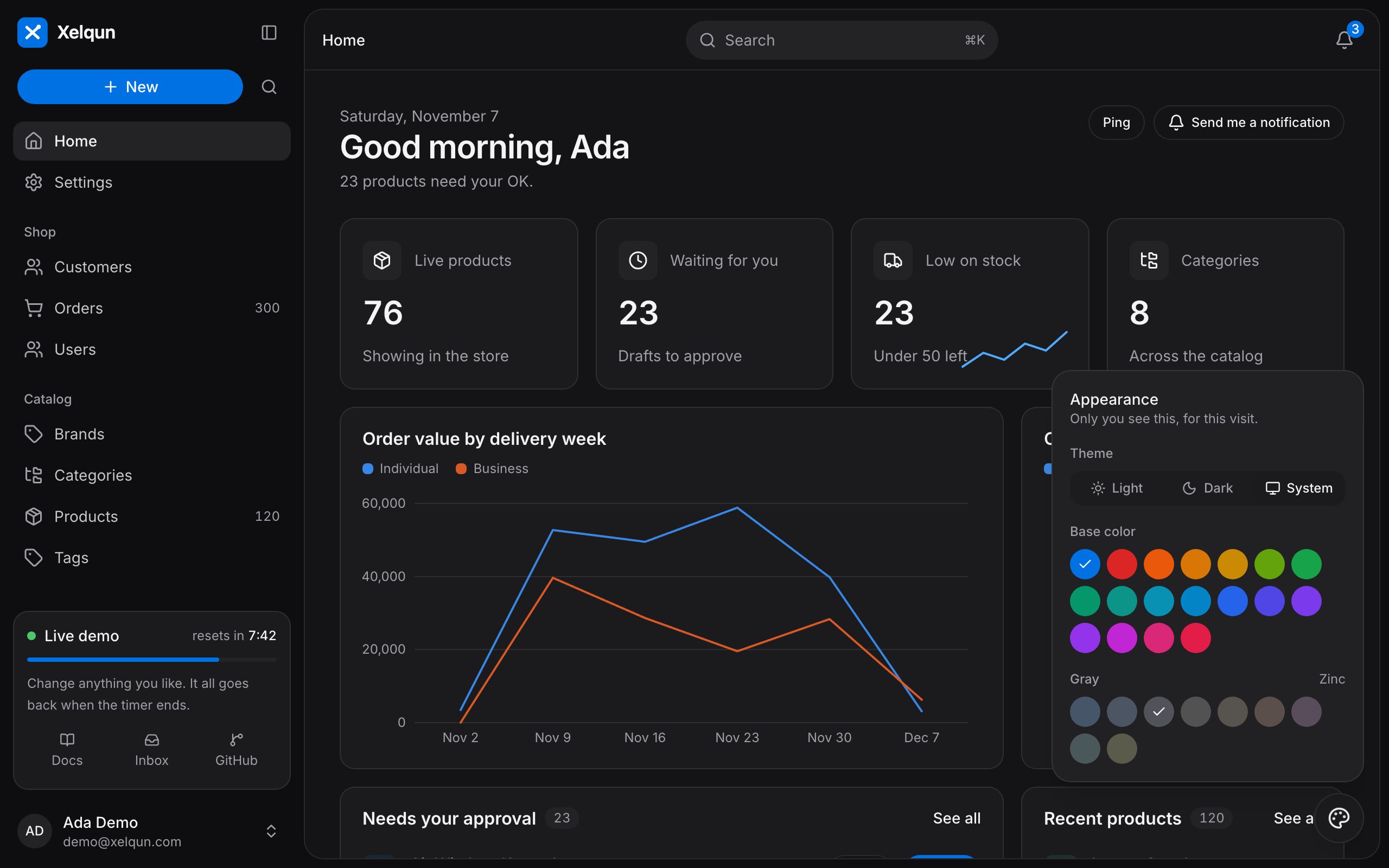
Try it in the demo: the palette button at the bottom right changes the theme, the base color and the gray.